Exploring Power BI Tools and Features You Should Know
Jul 31, 2024In today’s data-driven world, staying ahead means mastering the tools that help us make smarter decisions—quickly and efficiently.
In this post, Sodiq Yusuf, Business Intelligence Analyst, and Lead Trainer at dbrownconsulting, dives into the must-know features of Power BI that every data professional should have in their arsenal. Whether you're new to Power BI or looking to sharpen your skills, this exploration will help you uncover the true potential of the platform, transforming how you visualize and interpret data.
With Sodiq guiding you through essential tools and features, you’ll be ready to level up your reporting game and start delivering data-driven solutions that matter.
Let’s begin!
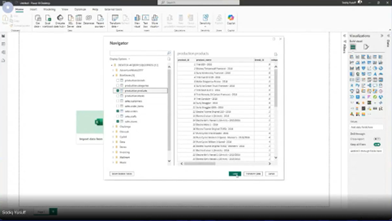
Open Power BI, and select Get Data under the Home tab. For this exercise, we will be connecting to an SQL server.
The file used can be accessed here xxxx.
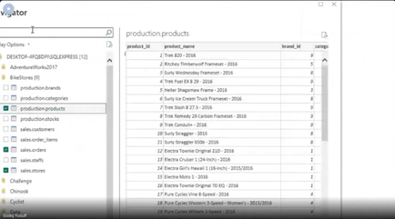
Now, PowerBI has established a connection to our server, we can expand each server to see a drop-down of tables contained within.

So now, we will be connecting to three tables: production.products, sales.orders, sales.stores.
Now, that our data is opened in the Power Query Interface we will click on Close & Apply to load the data into PowerBI since our data is clean and ready to be used.
Before we go ahead to create our report, we have to check the relationships between the tables we just brought into PowerBI.
Go to the Model View on the left pane of PowerBI. To make connections between tables, you look out for which column is common to both tables that you want to make connections with.

How to Connect to an Excel File on Your OneDrive
Go to Home tab and click on Get Data. In the dialog box, search for OneDrive or select Web (for a URL-based connection).
Open your OneDrive in a browser, right-click the Excel file, and choose Copy link. Make sure the link type is set to "Anyone with the link" or similar, depending on your organization’s settings.

Then, you provide the URL to the file and click “ok” as requested below:
How to Transform & Visualize Your Data
From this file we just connected to, we are going to be connecting to these tables: Customer, Product, Sales. And Sales territory. Now click on Transform data, which takes you to the power Query view.

Analyzing the performance of our products
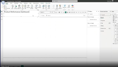
Click on ‘Text box’ under Home and type in ‘Product Performance Dashboard’. This will be the title of the dashboard we will be creating.
💡Note: Making comparisons in business provides context, helping to track trends, benchmark performance, and identify anomalies. Power BI enhances this by visualizing data for clearer insights. Also, these comparisons become automated, interactive, and visual, allowing you to gain real-time insights and make quick, confident business decisions. It enables data-driven decisions by comparing current results to past performance or industry standards. This leads to more informed and impactful business strategies.
So, bring in your Zebra card visual, and from the sales table, bring in “Total product” and COGS_LM under the KP Table.

Now we will be making a comparison of Sales. Still using the Zebra Visual Card, click on Sales Amount under “Sales” and then under “Sales” and select Sales_LM.

Now, we’re going to insert Slicers to enable us to filter our existing report by Months and Years, to give proper contexts to the comparisons we are trying to achieve.
So, click on “Slicer” visual, and select “MonthName” under “Calendar”. Copy and paste the slicer and select “Year” under Calendar. Now we have two slicers to filter our report by.
As you can see below, the current report is filtered to show results for “April 2018”

Now to compare how our business is doing by product and by location, we insert another Zebra chart.
💡 Note: As with other Microsoft tools, you can also Copy (Ctrl+ C) and paste (Ctrl +V) functions to insert a new Zebra card visual (or any other visual in Power BI) from the previous ones created.
To analyze the different cities where our customers come from, go to “Customers” and click on “City” and from sales, select “Sales Amount”
💡 Note: The Zebra Visual card can be toggled in different ways to make the outcome of your visual look like a table or a chart. See below:

The zebra chart above shows the sum of Sales Amount and Sales_LM by City
To determine the number of sales generated by the different categories of products being sold by the business, select the bar chart visual and then select “∑Sales Amount” and “Subcategory”
As shown below, there are only two sub-categories: Road Bikes and Mountain Bikes.
Profit by Product

We can include another slicer to filter your report by Country-Region.

Implementing Role-level Security in Power BI.
This entails setting up roles and defining rules that restrict data access based on the role a user is assigned in an organization, which enhances data security and data governance.
To achieve this, go to the “Modeling Tab”, under which you will see “Manage roles” as shown below:

For example, to create a role for the US country manager, select “Manage Roles” under the Modelling Tab and then click on “New” to create a new role and rename it to “USA Manager”.
Under the “SalesTerritory” in the “Select Tables pane, type in the country you would like to filter by in the Value section, under the ‘Filter data’ pane. In this case, we will be filtering by “United States of America

Creating Dynamic titles using a DAX measure
The formula- (Dynamic Title = SELECTEDVALUE(Customer[Country-Region]) & " Product Performance Dashboard") dynamically sets the title of the dashboard by joining the selected value from the Customer[Country-Region] field with the text " Product Performance Dashboard". This allows the title to change based on the selected country or region in the report as shown below.

Leveraging AI in your Reporting Using the Smart Narrative Visual
After creating your report, select the Smart Narrative visual from the visualizations pane. It will automatically analyze the entire report page and generate a textual summary, highlighting important data points like trends, outliers, and comparisons.
You can customize the generated narrative by editing the text and adding dynamic values from your data, making it more relevant to the story you want to tell.

To know more about how to utilize Power BI effectively, catch up with our full webinar here and you can check out other blog posts here.
